
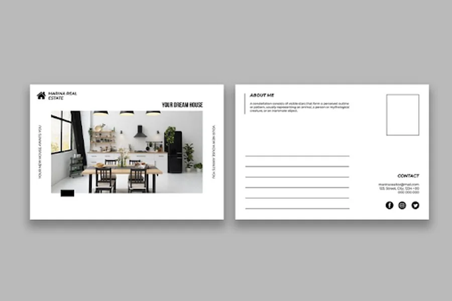
Most people picture a postcard as a leftover from vacation trips or a quick “wish you were here” note. But in 2026, that flat piece of cardstock has quietly become one of the most effective tools in a marketer’s kit. It lands in a mailbox that isn’t crowded with 200 unread emails, it doesn’t need to be opened, and it gets a few unguarded seconds of a stranger’s attention before they decide what to do with it.
What happens in those seconds depends almost entirely on design.
A well-designed postcard doesn’t just announce a sale or a new product — it tells the recipient, in a glance, who a brand is and what it stands for.
Here’s exactly how a handful of deliberate design choices accomplish that, turning an ordinary mailer into a genuine brand statement.
1. Establish a Consistent Visual Identity
The very first requirement a postcard must meet is to make it absolutely clear that it comes from the brand that sent it. In terms of logo placement, brand colors, and font style, the postcard needs to match those used on the web page or in the store window.
A discrepancy here will make the recipient pause and wonder, Is this really my favorite brand, or is it someone else’s product? That moment of doubt is more than enough to leave the message unread.
That is why companies that use custom postcards for mailing campaigns pay as much attention to size, paper quality, coating, and design as to the postcard’s content.
2. Say One Thing Clearly Instead of Everything at Once
A postcard stuffed full of every single promotion, number, and contact point that a business has will fail.
Postcards that people remember always have one clear message and an easy-to-focus-on action, with enough white space to give the eye somewhere to rest. It is not by saying more that a brand message gets sent, but by saying the right message without competing against itself.

3. Signal Quality Before a Single Word Is Read
The selection of coatings like gloss, matte, or soft-touch lamination affects how the postcard feels, and that sensation shapes its perceived quality before the recipient even reads a word.
A flimsy postcard makes the brand feel flimsy too; a well-made, durable one signals credibility and care. This tangible quality can’t be reproduced in any digital ad, and it lines up with research into how physical materials shape perception and memory.
4. Make the Message Feel Personal, Not Mass-Produced
Even just having the recipient’s first name at the front, or even personalizing the message with some offer based on past purchases, makes a huge difference. The piece of junk mail no longer feels like mass advertising; it is clear that it was intended for that particular household.
Personalization is one of the quickest ways to transform a postcard from “junk mail” into something “my bank/dentist/favorite store sent me,” which is exactly the idea behind the brand statement.
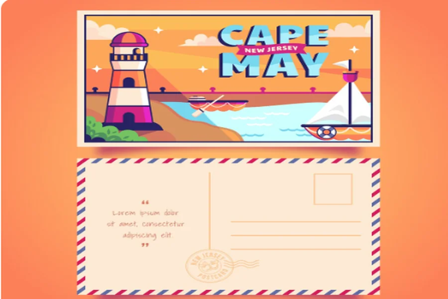
5. Give the Recipient One Obvious Next Step
A QR code, a promo code, or a phone number — whichever the postcard uses — should make it easy to act immediately. When postcards require people to sift through an entire paragraph to find out how to respond, or present three different action paths at once, they undercut the clarity the design worked so hard to establish.
6. Build Recognition Through Repetition
Companies that maximize the potential of postcard campaigns don’t view them as an event but as an ongoing effort. The postcard goes out on an ongoing basis — after a purchase, around a particular season, or in conjunction with a win-back series. In addition, all postcards feature the same graphic identity.
After several send-outs, the graphic design itself becomes recognizable; the recipient doesn’t even have to read the copy, since the card’s color and composition will tell them enough about the sender.
This is the moment when the postcard stops being just a marketing tool and becomes a true brand extension, standing alongside signage and packaging design as another place the brand shows up consistently.
The larger the format, the greater freedom the designer has when arranging the message hierarchy — the headline, the picture, the offer, and the call to action. At the same time, the standard format works great for frequent, fast-paced send-outs — such as scheduling reminders or thanking your clients.
For companies exploring direct mail options, integrating postcard design services into an organized mailing service helps reduce many of the uncertainties related to the list and timing.
The Bottom Line
Postcards aren’t competing with digital marketing so much as complementing it.
A sharp, well-produced postcard can drive someone to scan a QR code, visit a website, or remember a name the next time they need what that business sells.
The lesson for any business weighing a postcard campaign is straightforward: treat the design with the same care as a website or storefront. Get the identity, clarity, materials, personalization, and repetition right, and a mailing that could have ended up in the recycling bin instead becomes a small, tangible reminder of who a brand is.
