
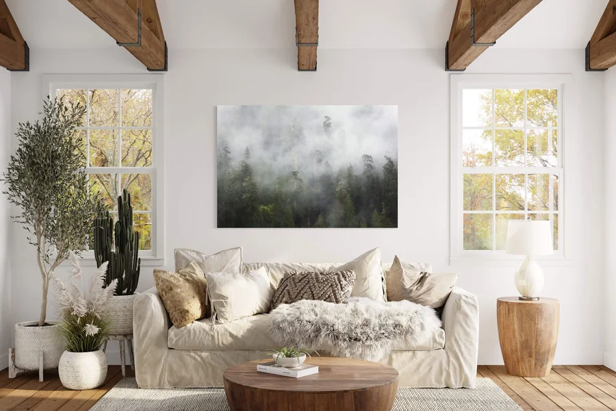

Biophilic living begins with the relationship between a home and the natural world. Plants play a visible role, but they work alongside daylight, natural materials, earthy colors, and views outdoors. A room feels connected to nature when these elements support one another. Filling every available shelf with greenery rarely creates that connection by itself.
A crowded room can contain beautiful plants and still feel uncomfortable. Leaves may block the window, pots may compete with patterned curtains, and oversized furniture may leave little space to move. Adding more natural objects will not resolve those problems. The first step is to understand what the room already offers and what interrupts its comfort.
Daylight provides a useful starting point. Observe where sunlight falls in the morning, how far brightness reaches during the afternoon, and which corners remain dim. Check these conditions before choosing plants or paint. A wall that looks warm at midday may appear dull under evening lamps, while a seemingly bright shelf may receive little usable light.
Existing views can shape the interior without requiring new purchases. If a window overlooks trees, position seating so people can enjoy them. Remove unnecessary objects from the sill and use curtains that open fully. Even a narrow view of branches or sky can become part of the room when furniture stops competing with it.
Daily routines should guide the arrangement. A family living room needs clear routes between doors, seating, and storage. A home office needs an accessible desk and enough room to adjust the chair. Greenery belongs within those routines. A plant that must be moved whenever someone opens a cupboard will soon become a nuisance.
Visual weight helps explain what a room needs. A space filled with low furniture may benefit from one tall plant. A room dominated by hard surfaces may need linen curtains, a textured rug, or larger leaves. An interior with many small accessories may need fewer objects and broader areas of uninterrupted color.
Existing materials also deserve attention before anything changes. Warm oak flooring, gray upholstery, and cream walls already establish a direction. New stone and planters should respond to those finishes. Working with the room’s strongest features usually creates a more coherent result than attempting to introduce an entirely separate decorative theme.
A modest living room offers a useful example. Suppose it contains a gray sofa, an oak coffee table, pale walls, and one window overlooking a courtyard. The room does not need a complete renovation. It needs a clearer connection between its window, seating area, materials, and colors. Those relationships can develop through a small number of deliberate changes.
An initial edit creates space for those changes. Remove accessories that no longer serve a purpose, clear the window, and test whether a side table blocks circulation. Keep useful furniture and meaningful objects. Biophilic design can accommodate books, family photographs, and everyday belongings; its character comes from how they sit together.
A clear brief prevents random buying. For the example room, the brief might be simple: introduce height beside the window, soften the sofa area, repeat the warmth of the oak, and leave the main walking route open. Every later choice can answer one of those needs. That gives the room a direction before plants or materials arrive.
2. Build a Living Canopy With Plants at Different Heights
Layered plant styling creates depth by placing greenery at different levels. Outdoor spaces contain growth above eye level, around the body, and near the ground. An interior can borrow that arrangement without copying a forest. One tall plant, two smaller companions, and a trailing stem may provide enough variation for an entire seating area.
The tallest plant establishes the main point of attention. Place it where its eventual size fits the room and where available light suits its needs. A corner beside a window may work, provided the leaves do not obstruct curtains or press against furniture. Allow space around the plant so its shape remains visible.
Growth habit matters as much as current height. An upright plant occupies space differently from one with broad, arching leaves. Before buying, consider how the plant may expand and whether the room can accommodate it. A compact specimen in a shop can eventually crowd a narrow passage or extend over a frequently used chair.
Middle-height plants connect the larger greenery with furniture. A plant on a side table or low stand can bring leaves closer to seated eye level. Choose a position that leaves room for the table’s original purpose. A surface used for drinks, reading glasses, or a lamp should retain enough clear space for those objects.
Lower planting gives a grouping a base. A smaller pot beside a taller planter can reduce the abrupt jump between floor and foliage. However, floor-level plants still need suitable light and protection from passing feet. Avoid pushing them beneath furniture simply to fill an empty patch that nobody can see clearly.
Trailing plants introduce a different movement. Their stems can soften the edge of a shelf or connect an elevated surface with the space below. Keep growth away from frequently handled books, electrical equipment, and doors. The shelf must support the pot securely, and watering should not require an awkward climb or risk spilling onto furniture.
Leaf contrast makes a small collection more interesting. Broad leaves beside finer foliage create a clear difference in shape. Upright growth beside an arching form adds another variation. Select a few contrasts rather than collecting every available texture. Too many competing silhouettes can make an arrangement difficult to read.
Grouping plants can give greenery more presence. Three compatible pots arranged near one another often create a stronger visual statement than the same pots scattered across distant shelves. Leave enough separation for leaves to develop and for each pot to remain accessible. A grouping should still allow inspection, cleaning, and watering.
Scattered plants work when they establish a deliberate rhythm. One near the window, another beside a reading chair, and a third on a suitable shelf can connect separate parts of a room. Their planters or foliage should share something visually. Without that connection, the collection may resemble objects placed wherever a spare surface happened to exist.
Planters provide continuity beneath the leaves. Terracotta introduces warm orange tones, matte ceramics offer quieter color, and woven outer baskets add texture. Choose a limited selection that relates to the room’s palette. Different sizes can still belong together when their colors, surfaces, or proportions have a clear relationship.
Drainage and furniture protection belong in the design from the beginning. Decorative containers may need an inner pot, liner, or tray depending on their construction. Check for moisture after watering and protect wood, stone, and flooring from standing water. An attractive planter loses its appeal when it leaves a stain beneath it.
Plant selection should reflect the household’s care habits. Someone who travels frequently needs a different collection from someone who enjoys tending plants every few days. Research each plant’s light and watering requirements before bringing it home. In homes with pets or young children, check whether the chosen species presents a concern and place it accordingly.
Open space completes the arrangement. Leave part of the window clear, preserve a stretch of bare wall, and allow the eye to rest between clusters. In the example living room, a tall plant beside the window and a smaller companion near the sofa may be enough. Additional greenery should earn its place through light, proportion, and daily use.
3. Give the Greenery Some Ground With Stone and Texture
Natural stone adds solidity beside the movement of leaves. Its grain, veining, and surface variation introduce another expression of nature into the room. Stone works especially well when it has a clear role: supporting a lamp, holding everyday objects, or forming a small table. Its presence does not depend on covering a large area.
A small stone accent offers a manageable starting point. A tray on a wooden coffee table can gather remotes or coasters while introducing a contrasting surface. A stone lamp base adds weight to a side table without consuming much useful space. These pieces let readers explore the material before considering more substantial changes.
Different stones bring different visual qualities. Limestone often has a subdued appearance, while travertine commonly shows visible pores and irregular markings. Slate can introduce darker tones and a layered surface. Marble may provide stronger veining. Individual pieces vary, so examine the actual object rather than choosing from a material name alone.
Surface finish changes how stone behaves visually. A polished piece reflects light and can become a prominent accent. A honed surface usually appears quieter and more subdued. Rougher finishes emphasize texture but may suit decorative objects better than frequently used surfaces. Choose the finish according to both appearance and the object’s job.
Scale determines whether stone feels grounded or cumbersome. A substantial side table can balance a large plant, but the same table may overwhelm a tight seating area. Several tiny stone ornaments can create unnecessary clutter. Match the piece to nearby furniture and check that its footprint leaves the room comfortable to navigate.
Undertones connect stone with the broader interior. A creamy piece may sit comfortably beside warm oak, while cooler gray stone may relate to existing gray upholstery. Neither combination is mandatory. The aim is to identify the colors already present and repeat selected tones so the new material looks intentional.
Soft materials balance the stone’s visual hardness. Linen curtains, wool cushions, or a woven rug can create variety around a stone table. Wood adds another useful transition between rigid mineral surfaces and loose foliage. These contrasts give the room depth without relying on numerous decorative objects or highly patterned finishes.
Furniture can reinforce the same material relationships. Cafés often combine greenery, stone counters, and wooden restaurant tables and chairs to create welcoming dining areas. At home, the useful lesson is the balance between surfaces: substantial pieces provide structure, while leaves and textiles soften their surroundings. Choose proportions that suit domestic routines.
Practical care should influence the choice of stone. Some surfaces absorb spills or react poorly to particular cleaners, and treatment requirements differ between products. Ask the supplier how the piece should be cleaned and whether it needs sealing. Follow that guidance instead of assuming every natural stone can tolerate the same household products.
Weight deserves consideration before installation. A stone object may be heavier than a similar wooden or ceramic piece. Check the capacity of shelves and furniture that will support it, and plan how larger items will be moved. Protective pads can help prevent scratching where an object rests, provided they suit the surface and load.
Repetition gives one stone accent a place in the room. In the example living room, a pale stone tray might connect with cream curtains and a light ceramic planter. The oak table supplies warmth, while foliage adds movement above it. The materials remain distinct, but their shared tones make the arrangement feel connected.
4. Borrow Nature’s Color Relationships, Not Just Its Greens
Earthy color palettes extend well beyond green and beige. Nature offers pale bark, reddish clay, blue-gray rock, dark soil, dry grasses, and muted flowers. The most useful approach is to choose a small group of related colors from one setting. That creates direction while leaving room for the furniture and foliage already present.
A woodland palette combines depth with lighter relief. Moss green, bark brown, cream, and charcoal can work together through paint, wood, textiles, and accessories. Use the darker tones where the room can accommodate their visual weight. A charcoal cushion or dark planter may provide enough contrast without requiring an entire wall.
A dry-terrain palette introduces warmth through clay and sand. Warm off-white walls can support terracotta planters, muted olive upholstery, and natural wood. Keep the orange or reddish tones controlled if the room already contains warm flooring. Repeating them in two or three places often creates a clearer result than spreading them across every surface.
A rocky-coast palette provides a cooler alternative. Pale stone, driftwood brown, soft gray-blue, and restrained green can suit interiors with gray furniture or cooler daylight. Add texture through woven fabric and wood grain so the room retains depth. A palette can feel natural without relying on warm beige as its main background.
A dominant color gives the eye a stable base. This usually comes from the walls, floor, or largest furniture pieces. Supporting colors appear in curtains, rugs, and secondary furniture. Smaller accents can introduce a darker or richer tone. The exact proportions matter less than keeping a clear hierarchy between these roles.
Foliage already contributes to that hierarchy. A large plant may introduce a considerable area of green, especially against a pale wall. Consider its color before adding green cushions, green paint, and green ceramics. Repeating green can look deliberate, but the room may gain more variety from clay, cream, brown, or blue-gray companions.
Lightness creates separation between neighboring objects. A dark planter against a dark wall may disappear, while a lighter pot allows its outline to remain visible. Similar tones can also work when their textures differ clearly. Check the arrangement from the doorway and from the sofa, where people will see it most often.
Texture keeps a restrained palette from appearing flat. Cream linen, pale stone, and light wood may share a similar color range while offering different surfaces. The folds of fabric, grain of timber, and markings in stone provide visual detail. That variety allows the room to stay calm without becoming monotonous.
Paint samples need testing in their actual location. Place them beside the floor, sofa, and other finishes that will remain. Observe them during daylight and under the lamps used at night. A color chosen from a small shop sample may look different across a wall or beside an existing material.
Evening lighting should support the chosen colors. Check how bulbs affect the appearance of clay, cream, and green after sunset. Lamps near the seating area can reveal texture and keep the room comfortable when the window no longer provides light. Position them so leaves do not cast distracting shadows across a reading surface.
Renters can build the palette through movable pieces. Curtains, cushions, rugs, planters, lamps, and artwork can establish a strong relationship without altering walls or floors. Begin with the colors imposed by the property, then choose additions that connect them. A coordinated room does not require replacing every finish.
The example living room could use a restrained woodland direction. Its oak table supplies brown, the sofa provides gray, and pale curtains introduce cream. Green foliage becomes the main color accent, with a small charcoal detail adding depth. Each choice responds to something already present, keeping the transformation focused and manageable.
5. Make It a Home You Can Maintain
A successful biophilic room remains comfortable after the styling session ends. Plants need care, surfaces collect everyday objects, and furniture must accommodate real use. The final arrangement should make those activities straightforward. A room that looks appealing only when nobody occupies it needs further editing.
Begin the transformation with the largest decisions. Clear the window, adjust furniture, and establish the main color direction before adding accessories. Then position the tallest plant according to light and available space. This sequence makes it easier to judge what the room still needs and prevents small purchases from driving the entire design.
Add supporting elements gradually. Introduce a smaller plant, live with its placement, and check whether it interferes with the table or seating. Bring in the stone accent once the main arrangement feels settled. A slower process reveals practical problems before the room fills with objects that are difficult to accommodate.
Watering access should remain simple. Leave enough space to reach each pot, check the growing medium, and remove the plant when necessary. Keep clothes or trays nearby if the routine requires them. If a shelf arrangement takes considerable effort to dismantle, reconsider whether that location suits a living plant.
Cleaning access matters just as much. Leaves, pots, and textured objects can make dusting more involved when they sit tightly together. Allow room to move a cloth around them and reach the floor beneath stands. A smaller collection with accessible surfaces is easier to keep attractive over time.
Plant growth will change the composition. Rotate or reposition plants when appropriate for their care, prune where suitable, and reassess the space they occupy. A trailing stem may eventually cover a lamp, while broad leaves may extend into a passage. Treat these changes as part of maintaining the room rather than signs that the original design failed.
Seasonal light can require another adjustment. Observe how daylight changes through the year and whether nearby trees or curtains alter what reaches the plants. Consult the requirements of each species when deciding whether to move it. Decorative balance should follow suitable growing conditions when the two come into conflict.
Useful surfaces should stay useful. Keep room on the coffee table for drinks and on the side table for a book or phone. Preserve access to storage, switches, and curtains. Natural materials and greenery contribute most when they sit comfortably within ordinary activities, without requiring constant rearrangement.
The finished example room succeeds through a handful of connected decisions. Clear daylight reaches the greenery, the oak relates to the stone and textiles, and the palette links the sofa with its surroundings. Open space gives those elements room to be seen. The room feels connected to nature because its parts belong together—and because the household can comfortably live among them.
